塞林格作品新封面
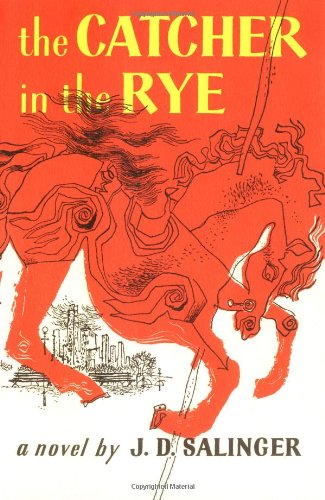
塞林格肯定是一个奇人,其中一奇是他对自己作品的封面设计要求极为苛刻,不过他作品的(美国版)封面却多不好看,比如代表作 The Catcher in the Rye 的封面,我就无论如何喜欢不起来:
不知道是不是由于某些封面设计不佳的原因,塞先生才对封面变得苛刻起来。不过,丑陋的局面即将改变了,《卫报》报道,塞林格作品将以新的系列封面重印上市:
Before his death, JD Salinger’s publisher, Hamish Hamilton, worked with him to produce jackets for reissues of his books (originally planned for June, they are now due out next month). …
Simon Prosser, publishing director, Hamish Hamilton: “There are strict rules about JD Salinger’s covers. The only copy allowed on the books, back or front, is the author name and the title. Nothing else at all: no quotes, no cover blurb, no biography. We’re not really sure why this is, but it gives you definite guidelines. Last year we decided it was probably time to re-design the covers, and we wanted a unique typeface that stood out. We commissioned Seb Lester, the highly regarded type designer, to hand-draw a font; that font, on the cover of these re-issues, is a one-off and is known in-house here at Hamish Hamilton as the ‘Salinger’.”
这套新封面是 Seb Lester 设计的,相当赏心悦目:

This collection, originally published as Nine Stories in the US in 1953, contains some of Salinger’s greatest short fiction, including the title story (first published in the New Yorker in 1950), in which an army sergeant recalls his meeting with a young girl before he was sent to war, and A Perfect Day for Bananafish, the first of Salinger’s stories of the Glass family.